see2think

thinking with pictures – metaphors that let you see the subject from new angles


Leave a comment

Too Much Information – color that overwhelms

Screenshot of 12 thumbnail photos in collage of sunset skies, apparently edited in post-processing software to amplify the saturation.
Flickr (creative commons license) search results for “sunset” showing sometimes too much intensity to be real [screenshot]

Seeing all this color concentrated in a single screen filled with images is rich food for the eyes. Just one shot would be a feast for the eyes, even for a glutton. But when all of them appear side by side, it feels oppressive; too much information. Looking at them one at a time, there is a dramatic intensity of colors present. In the realm of optics and editing, both hue and saturation seem to be increased beyond the visual experience of a person’s eye.

In real life with the unaided eye, there are times during the Golden Hour and then Blue Hour when colors are richer than usual, but those instances like the ones in some of the photos, above, are rare and last briefly. When presented as static images one after another, like the collage above, it is just too much to believe or to enjoy. One reason for this reaction to richer than normal colorfulness could be the corresponding contextual conditions surrounding such a state of affairs. That is to say, the kind of moment capable of producing such dense coloring feels uncomfortably strange: barometric and other weather conditions foretelling dangerous developments, for instance. By contrast, less spectacular and commonplace sunsets do not portend anything ominous. The normal sunsets are attractive, but such an ordinary photo does not “gild the lily,” as the poetic image goes from generations ago.

Another atmospheric condition that makes colors unnaturally saturated is particulates suspended at high altitude after weeks of upwind forest fires or even more distant volcanic eruptions. Many of the photos in the above collection of shots seem to display that degree of amplified intensity. And yet with no precursor ash in the air, it must be a function of the photo editing software that this amount of richness is ladled on so abundantly. This emotional response to “too beautiful” or “too richly colored” is a reminder that human senses, engagement, and attachment has a range of “too much” and too little and “just right.” Sometimes that sweet spot is called the Goldilocks Principle, after the children’s story of The Three Bears and the little girl who intrudes while the bear family has momentarily left their abode.

So it is not just teachings of children’s stories, The Golden Mean, and photographs that are too something: bright, dark, richly colored, altered by software or darkroom tools. The many other departments of human lives and their daily habits also have upper and lower thresholds for maintaining conditions that are normal, desirable, healthful, and so on. By scrutinizing the sunset collection, above, the same logic can be applied from photos to life overall: about recognizing and guarding those boundaries of taste, propriety, structures of meaning and making of knowledge. What is less certain, though, is precisely where the boundary of too much or too little lies. Along a finely graded spectrum, one person could put the boundary here, but another person could extend the normal range a bit more. Even the same person might move the boundary, depending on time or day, season, or who they are interacting with at the time of drawing the boundary.

Leave a comment

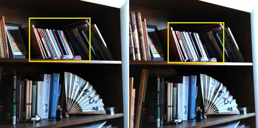
Glare coming from standpoint relieved in a few inches

collage of two photos of paperback books on shelf lit by window at the right edge
Shiny book spines (right box) clarified by sliding lens toward the window light to alter the reflection angle (left box)

Angle of incidence is a fancy way of describing the relative positions of the lens, subject, and light source(s). This photo shows the same subject and lens giving a different amount of glare on the spine of the books, based on the position of the lens in relation to the window. About 10 feet to the right of these books is a window letting in the western sky this morning. Even though the sun is still in the east, it is this nearby window at the opposite end of the house that is providing light for the books. Rather than to use this observation as the starting point to discuss optics and the geometry of light, instead the pictures can be used to show how a shift in lens position relative to the light source can increase or decrease the glare from shiny reflection.

By extension to the wider world of thinking and moving through the pathways of social life and the trajectory of a lifetime of years, something similar may be true: shift your lens position (standpoint for thinking or the angle of view for your eyes) and the resulting image may be easier to see; or the reverse – things may increase in shininess, making it hard to read the situation clearly. In other words, when faced with conditions in which it is hard to get a clear understanding of the situation, consider shifting your standpoint (for eyes) or way of regarding the matter (for thinking) to discover if the resulting view becomes better than before or worse; more glare or less. Sometimes there really is a direct analogy from seeing with light and optics on the one hand and understanding things more generally with one’s mind.


Leave a comment

Geometry echos and intensifies what is in view

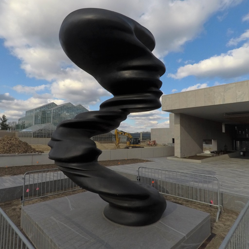
photo with 'S' shaped body of a statue in foreground and yellow excavator parked with bucket arm similarly bent to the statue
The elbow bend of the statue echos in the arm of the background excavator [Meijer Gardens: Tony Cragg “Bent of Mind”]

Others have pointed out how important the position of the lens can be in creating visual interest (tension or absence of it). Just an inch left or right, up or down, nearer or farther from the subject can alter the relationship of foreground and background juxtaposition. And Henri Cartier-Bresson‘s writings point to his childhood fascination with geometry as the basis for his professional life in composing pictures as he came to do.

This photo illustrates how a repeated shape or echo in one line to another can be eye-catching, causing a curious person with a camera to stop and frame a snapshot. In this case there is a fit between the bend in this statue and the bend in the yellow digger in the distance. It is not a perfect fit, but it is instead more of a family resemblance: recognizable, but not a perfect copy. In addition, the top right corner of the photo draws together several rectangles. When the eye notices first one and then additional ones of similar (rectilinear) character, then suddenly a revealed significance can sweep the person into a larger movement or meaning. A feeling of bigger (secret) patterns of meaning touches the viewer. Other repeating elements are the panels of glass for the tropical greenhouse in the distance, as well as the fencing pieces around the base of this statue.

Brain scientists have pointed out that two functions in humans that machines cannot yet match have to do with the ability to perceive meaningful patterns (machines first must be filled with a catalog of instances to match field conditions with) and the power to discover relatedness or relationships between discrete things, sometimes tangible, but other times figurative or symbolic (e.g. the foot of a bridge and the foot of a person). So it is not only when looking through a viewfinder that viewers can find meaningful patterns and relatedness, also in many other arenas of lived experience can one find such meanings. Maybe the patterns and relationships are between the lines or they arise only on the second viewing of a movie, or from long years of conversation with another person, but arise they do.

Echoing can be found in the likeness that can be seen at a family reunion, as certain physical features, mannerisms, or habits of talking and walking can be seen recurring across the generations. And echos of a different kind can be seen in synchronicity, the phenomenon of someone or something catching one’s notice at one moment and then the same person or thing coming to one’s attention again, seemingly by (meaningful) coincidence, when one completes an errand, travel, or project, for instance, expressing a sort-of pair of bookends. If not “eye catching” like the compositions captured visually, then perhaps in other ways one’s attention can be arrested by something catchy to one’s ears, compelling to one’s mind, or meaningful to one’s palate.


Leave a comment

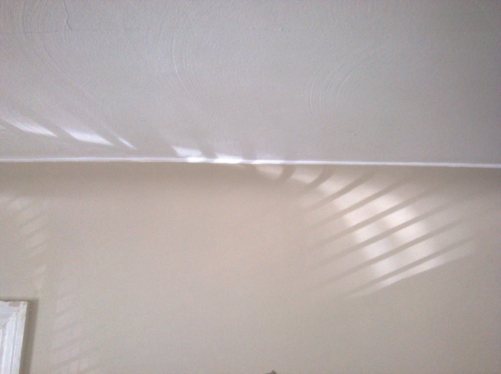
When shadows bend then look to surface or to source

photo of ceiling and wall with shadows from window blinds in parallel lines
Afternoon light from west window casts shadow of blinds onto ceiling and wall.

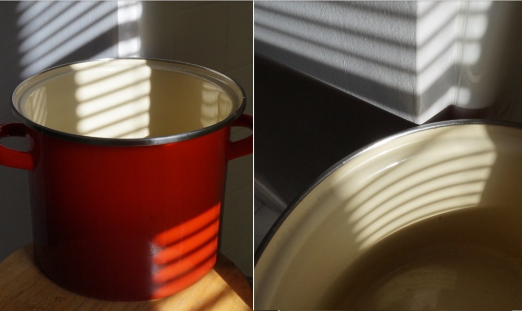
Both photos show parallel lines from window blinds as they play on curved surfaces and flat ones, too. The physics of optical phenomena can describe this geometry according to the properties of light. But even without knowing the science of light and shadows, anybody can gaze at the gentle bends of shadow and enjoy the moment of wondering why and how this comes to be so. Shadows and the surfaces they appear on vary widely, but most commonly it is a linear geometry or a flat surface that gives an expected result, free of surprises or mystery. Much less common are moments like the ones captured here: showing both a linear and a curving geometry in the same frame. Rarity is one thing that draws attention to the scene. Moreover, many viewers seem to assume that shadows are relatively solid or unmanipulable. So when the effect makes the shadow bend, that also seems to defy ordinary experience.

collage of 2 photos: left shows red enamel soup pot on stool, decorated by parallel shadow lines from window blind. The right-hand photo looks down into the pot where shadow lines are forced to curve on the pot's inner diameter
Straight shadow from window blind, but applied to curved surface produces bending shadows.

In keeping with the theme of this blog, seeing how the light on the subject stirs thinking and wondering, perhaps the lesson here is about the mysterious way that the shadows and the transmission of light (behaving as particles and as waves) can travel in straight lines, but when meeting a curving surface that presents parts that are nearer and other parts that are farther from the light source then the resulting image gives the impression of the shadow bending, as if it were a solid mass instead of the outline of something obscuring the light’s path. It would be fairer to say that the shadow (and the light) do not bend, but that the receiving surface is the thing that is revealed in its bending character.

Surely in the world of social life and the natural environment, too, there are analogies to this mix-up between appearances and actuality. The appearance is one thing, but the empirical conditions that produce that effect are something different. So the next time your eye is caught by shadows that seem to bend, stop to enjoy the beauty of the effect. But then remember that the appearance is not exactly what is going on. It is not the shadow and the light, but instead the illuminated subject that the pattern is applied to where the effect comes from. Or, as the proverbial wisdom puts it: Looks can be deceiving.


Leave a comment

The price of your picture

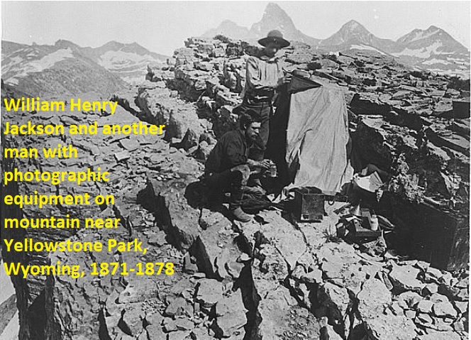
screenshot from Library of Congress collection of photos in the public domain: photographers with view camera on rocky outcrop
William Henry Jackson and another man with photographic equipment on mountain near Yellowstone Park, Wyoming, 1871-1878 [b&w film copy neg.] Public Domain. https://www.loc.gov/resource/cph.3b39745

“Not all photographs are created equal” could be a good description for appreciating a set of images displayed in an exhibition, illustrating a publication, or returned in an online search. People accustomed to carrying a portable Internet device during their waking hours are said to consume thousands of images per day. They make a few each days, too. Most are not scrutinized or worthy of immersing oneself in for more than a few seconds. But looking at these intrepid 1870s travelers charged with visually surveying the American West, it is easy to appreciate the physical stamina required to lug lens, camera, dark cloth, tripod, and all the chemicals and glass-plates needed to fix their exposures so that people crowded along the coastline and, indeed, future viewers in 2021 or 2121 could look at the composition, too.

By contrast, this screenshot from Christmas 2012 in middle Michigan was recorded on a digital camera that can be held in one hand. The electronic image can readily be transferred to computer for editing and then publishing online with no need for wagon, horse, or chemicals and publishing company.

wide view of Sunday church worship with Christmas pageant performed by children
Special seasonal music and decorations to celebrate Christmas in a Congregational Church in mid-Michigan, USA.

Comparing the black and white era of big gear to today’s period of devices that most people seem to carry most places, there is a “total cost accounting” that can be made. Just as certain businesses weigh all factors when coming up with the true cost of doing business (not just the accounts receivable and accounts billable), there is a price to make a picture that differs wildly in one case compared to another. Taking the 1870s example, above, there is the expense for gear and “film stock” (in this case chemicals and glass plates), transportation, food, and time. By contrast in the 2012 color example, above, much of the 1870s costs go away: no film stock (SD card for digital image files), location within walking distance of the photographer’s home, time budget limited to snap the exposure, transfer to PC, edit and share with others.

In addition to the physical, material costs enumerated here, there are also more intangible things to account for such as (technical) education of the photographer and hours of experience needed to attain a particular standard of skill: cultivating an eye to see effective compositions, building knowledge to translate vision onto the particular recording medium, exercising abilities to edit and publish the finished picture. And the subject matter itself adds to the cost: some nature documentary makers and observers may spend days or weeks waiting for a particular subject to reveal itself, if at all. Rare subjects “cost” more than common scenes being recorded. By reckoning ALL of these contributing costs, the true price of a picture can be estimated relative to other pictures Even when the particular mix of quantifiable and intangible inputs cannot be reduced to an absolute dollar figure, when expressed as a relative price of one photo versus another, it should be possible to appreciate what goes into making one exposure by comparison to another. In the 1870s photograph the expense was huge by comparison to the 2012 church scene.

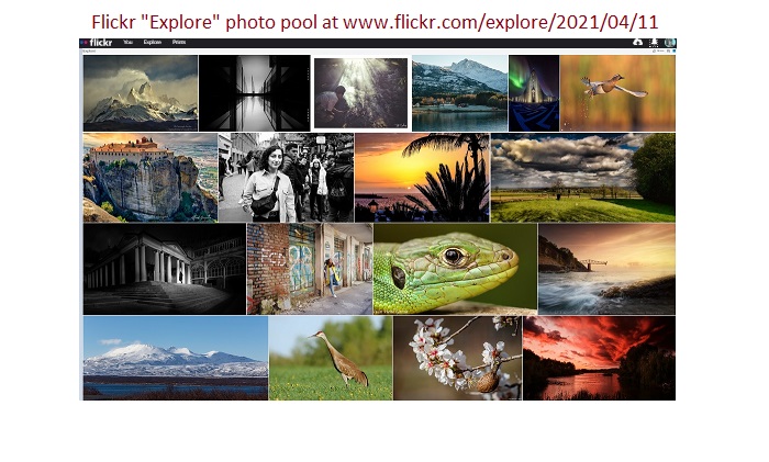
screenshot of 18 thumbnail images featured on April 11, 2021 in the daily selection by Flickr photosharing editors
screenshot with diverse settings, photographic expertise, camera siting and wait time

This collection of photosharing images changes with the daily selection by the editors of this web service. The range in subjects and the degree of composition sophistication is impressive. Some images on the street seem to be carefully timed and framed point-and-shoot examples. For beginners such shots require luck. For experienced street photographers there may be an instinct or awareness of compositions about to come together. By contrast, the distant or difficult to access viewpoints requiring particular weather conditions, a certain time of year or time of day do have a higher price, according to this “total cost accounting” way of appreciating the collected photos.

Most people admire a photo or find themselves attracted to certain light and settings, rather than to think about the cost required to accomplish the picture seen in the mind’s eye. But pausing just long enough to acknowledge the great effort needed for the 1870s photographer (not just sweat, but education, gear, and travel) adds another dimension to seeing and thinking with pictures. Truly, not all photographs are created equal. Some do cost more than others.


Leave a comment

With frame or without, that is the question

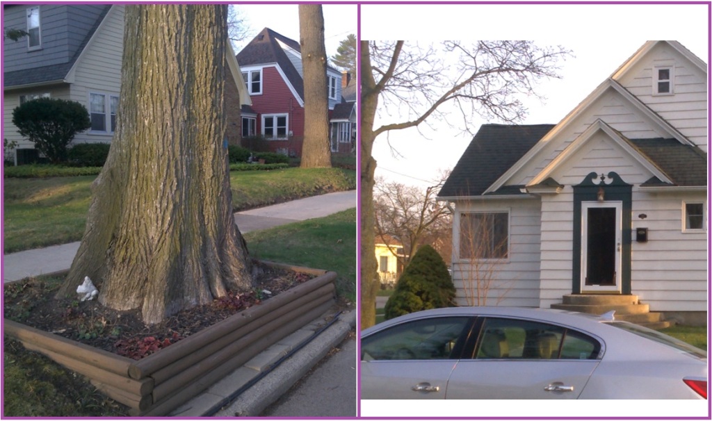
2 photo collage with base of mature oak tree surrounding with wooden frame to hold perennial flower bulbs (left) and front view of white clapboard house showing front door framed by decorative and contrasting black surround.
Frames for oak tree and for door define the subject, separate it from surroundings, and add emphasis.

Not many trees are capped with a frame like the one in this photo along a quiet residential street in west Michigan. Looking around, it soon becomes clear that many parts of daily life are framed visually or in more figurative ways (with words, with status or deference, by being “bookended” with contrasting elements that occur before and after the subject). Frames can be seen in packaging and shelf displays, in print and digital advertising, in book and magazine layout, in composition considerations for movies and still photos, in the finishing details of cars and trucks (fender shapes and chrome trim package, whitewall tires decades ago), on house trim paint to accent windows and doors, with eye-liner, for museum gilt borders to enclose the canvas, by underlining text, matte colors to complement the color elements in the enclosed image, and so on. In Japanese society there is a long tradition and great interest in presentation of products (and by extension services): the art of wrapping, packaging, marketing, and designing cases most suitable for a given item*. All of these forms of expression seem to function as a sort of frame, too, like the ones pictured in the photograph, above.

Thinking about the effect that a frame has on the subject contained, several things come to mind. A given subject lacking a frame seems to blend or blur into its surrounding space. The frame, in other words, makes a clear separation of the figure from its ground. As a result of this boundary, the viewer perceives emphasis or amplified attention placed on the subject and its adjacent frame. In other words, a framed subject stands out. Not only does the subject gain visual importance from its frame, and acquire an apparent independence and self-contained identity from its environment, but also the frame predisposes a viewer to look out for nearby instances of equal importance, thus skipping over and (relatively) downplaying what is not framed. In other words, the subject highlighted by its frame becomes a member of an exclusive club: all those things bearing a frame can be imagined to share some sort of heightened visual significance.

It is true that some frames are primarily structural, intended firstly to hold the flowerbed in place and only secondarily to give visual distinction to the mature tree in the above photo, for example. Many other cases use frames for visual purpose and only secondarily have a structural use. Perhaps this same primacy is true of the social, cultural, linguistic, and other figurative kinds of frame, too. In some cases there are practical reasons to draw boundaries (e.g. genres of TV show) and any decorative meaning or formal flourish of style and emphasis comes only incidentally. But in other cases it is the reverse priority: framing the bride and groom under a bower of flowers is firstly a visual emphasis to separate them from the rest of the people.

Considering all the visual frames, big and small, that fill one’s daily settings, it is worth thinking about the effects of this part of the places where one’s attention rests and eyes dwell. Frames add emphasis. They separate the subject from the surroundings. Sometimes they add structural integrity or conserve the subject. As an elevated status, the framed subject belongs to the class of other singled-out, framed subjects. By extension, the rest of the environment unadorned by frames is somehow less than important. Presentation matters not only in plating the food at an expensive restaurant. It also matters in all sort of ways, small and large, in the course of one’s day and indeed across a lifetime.

*see also Joy Hendry, Wrapping Culture: Politeness, Presentation, and Power in Japan and Other Societies (1995); Richard Chalfen 2021 Snapping and Wrapping.


Leave a comment

More than one way to monochrome views

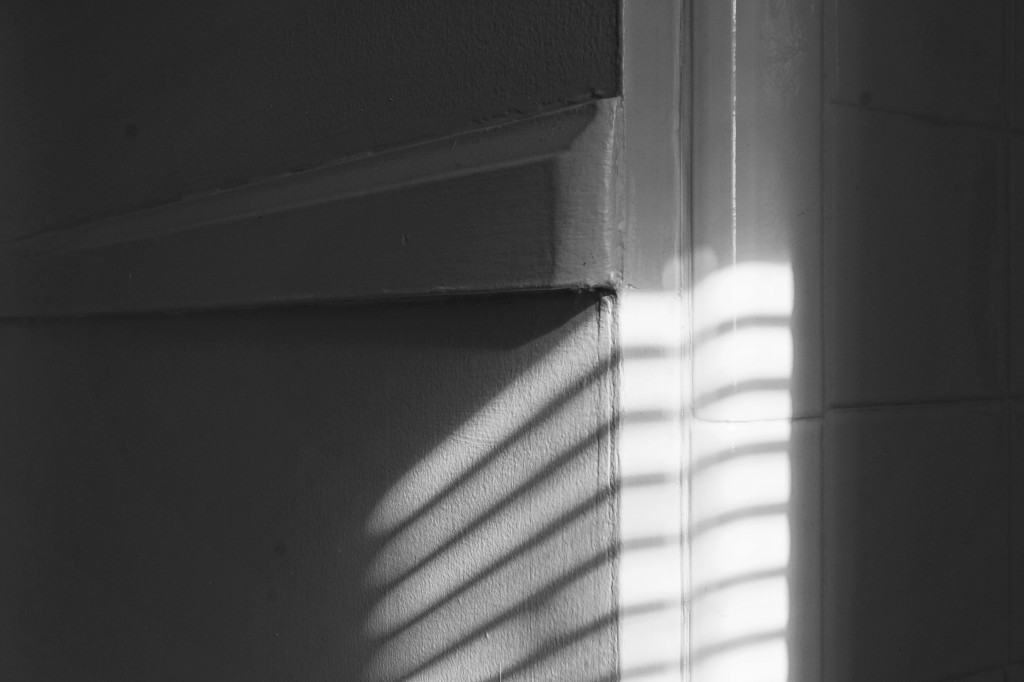
Bathroom wall in morning light, grays and whites [color photo]
Bathroom wall in morning light, grays and whites [grayscale from color photo]
Bathroom wall in morning light, grays and whites [special effect “rich black and white” auto-merging 3 exposures]

The subject of comparing black and white pictures to color ones invites many experiences and opinions. But when it comes to the basis for delivering the completed recording of a subject in the sober tones of 16-shade or 32-shade grayscale, less ink has been spilled. Among film users (and before that the glass-plate processes for wet plate or dry plate) there are preferences with regard to warmth (some film types have rich warmth, other types are cooler or bluish blacks) and graininess (larger clusters of silver in the negative to form film grain; greater light sensitivity usually includes more noticeable grain) and contrast (some are stark, others very mellow). And not surprisingly for digital rendering of images, there are similar effects programmed or processed into the final image: chosen graininess, contrast, and warmth. So in the choice of black and white film stock and method of processing it, or in the choice of digital processing of an image, a person can express a particular look and feel for a picture.

In the world of digital cameras, there is sometimes a setting –indeed a few monochrome-only cameras may be seen– to record the image only as black and white; no color file is made before deriving a grayscale photo from it. For example, there could be “rich black and white” (3 shots merged in HDR to produce a very wide range in light values), or “high contrast black and white” (stark rendering), or “posterized black and white” (abstract and dramatized rendering). Each of these examples rely on the camera’s onboard processor to create the image file. Rather than to limit the result to the onboard renderings offered, though, another way to produce a monochrome composition with a subject is to begin with a full color image file and then rely on post-processing of a computer software program to make a grayscale version of that original file.

The illustrations in this article include a “born black and white” photo (onboard ‘rich black and white’ setting), a grayscale image derived from the full color one, and then a 3rd version of the composition. Since the subject to begin with is a gray bathroom wall with white tile and chrome fixtures in low light, the full color picture of the location is practically monochrome to start with, even when captured “as is” with no grayscale conversion. The question remains: the “monochrome look” can be arrived at by these differing ways. And in the eye of the beholder, perhaps one way is more or less the same as another; the process leading to result matters in no discernible way. So, what consequence or significance can be learned from this experiment in photographing in black and white —using camera setting for black and white, using computer conversion of color to grayscale, or by virtue of this location’s light and the subject itself, just working in color but displaying what seems to be monochrome.

In the world of composing and viewing photographs, whether one way or another way is used, the difference is immaterial for this subject’s lighting and original coloration. There is a bit more dynamic range caused by the 3-shot merge (HDR) that comes from the “rich black and white” mode. But otherwise the geometry, texture, light and shadow in all three shots is largely the same. So in the end, only “behind the scenes” in the mind of the photographer is there any difference in each path taken to make the final picture. By knowing the steps that contributed to producing the picture one way versus the other way, the photographer perhaps regards one image as more laborious, more deliberate, more complicated to complete than another. As a result of this added “backstory” the photographer may appreciate the additional effort and engagement in the subject. In other words, while the finished photos may show little or no real difference, as a stakeholder with time and effort and skill invested, the photographer may stand with a slightly different posture, viewpoint, or attitude to the picture.

As for wider lessons in life from this case of “distinction with no difference,” there are doubtless many instances where outsiders cannot see how one way or another affects the outcome, but where insiders do know the time or effort that went into the one way compared to another. Raking leaves versus using a powered leaf blower, microwaved soup versus heated in a saucepan, going across the city in taxi versus ride-hailing app versus by bike or on foot, and so on. In all these examples, the net effect may be more or less the same. But in the mind of those who are most closely involved, the distinction does make a difference. In this interplay of form and content, means and ends, method and result, there is an echo of the fascination with “form factor.” A person dressed up compared to a person dressed “business casual” compared to at-home “leisure wear” can be said functionally to accomplish the same thing: covering up and staying warm. But the look and feel of one category of clothing does affect the person’s stature and expectations about “presentation of self” and self-identity in the eyes of the world. Form very often does affect content, but the distinction may well be of little discernible difference a lot of times –as in the case of the 3 ways to photograph the bathroom wall, above.


Leave a comment

If you were a lens…

Working a lot with one lens makes it natural to see photo situations in those terms, at that focal length.

Carrying a zoom lens makes possible a range of (focal length) magnifications. Often the supplied kit lens for an entry-level camera goes 3 to 5x in magnification, such as 24mm to 120mm (expressed in scale to a 35mm film camera or in terms of “full-frame” digital SLR). This way the photographer can approach a subject close-up with a wide angle of view, or the reverse, framing the subject while standing at a greater distance. By contrast, when working with a fixed focal-length, whether it is wide, telephoto, or “normal” (45mm-65mm referenced to full-frame dSLR) it takes a little while to incorporate that single optical perspective into one’s own eyes so that potential photographs can be rapidly envisioned as that particular lens sees things. Depending on the subject one most often engages in, it could be most often a wide, super-wide, normal, modest telephoto, or perhaps a really “long lens” (big telephoto).

Street photographers appreciate the wide depth of field and small form-factor of a wide-angle lens (above lens), allowing them to preset the approximate distance to capture most all the subject matter by merely pointing and shooting, requiring little more than a fraction of a second to raise the camera and snap the picture. Sports photography enthusiasts almost always are some distance from the action and rely on telephotos, modest or massive, to record moments in the competition. Little by little the photographer accommodates to the lens, either growing accustomed to the lens limitations, or selecting a lens that matches his or her own way of looking at things.

Putting this matter of one’s “go to” lens in a philosophical light, it is possible to imagine that each person most comfortably goes through the day or an entire lifetime most often relying on a certain “lens” with boundaries that frame things that could be super-wide, wide, normal, macro, modest telephoto, or big telephoto. For example, a person who likes to keep moderate or great distance between self and whatever subject is at hand could be said to see the world through a “telephoto eye” or mind. Others are focused on matters closer to hand, in wider context, and with relatively great depth of field (just about everything in the frame is in focus). Still others may be very, very detail-oriented (the special strength of a macro lens). And there could even be certain people whose default way of seeing things most closely resembles the variety found in a zoom lens (super-wide to wide; wide to modest telephoto; telephoto minor to major). Such a person jumps from a wide view of the matter to a much narrower, close-up look at the matter.

So when next you peer into a mirror, or happen to find yourself reflected on the LCD screen at the back of your camera, consider your own default “lens” for looking at things. Perhaps you are wide, macro, tele, or “normal.” One way to find out could be to review a few dozen photos you have taken to see what focal length you seem to use most of the time. Although the analogy from camera lens to one’s mind’s eye is not so simple, there may be some correspondence between how you frame pictures AND how you frame your life experience each day and across entire chapters of your personal and professional trajectory.


Leave a comment

Testing a camera’s specifications; testing your own self

screenshot with 3 rows by 8 clipart images for the search term "checklist"
Making a list of settings, features, and subjects in the camera owner’s manual to try out [screenshot of clipart “checklist”]

When undertaking photography with an unfamiliar camera, borrowed or new to one’s collection, it makes sense to learn about its features and functions. But more than reading, it is important to engage muscle memory by trying out the camera’s various technical specifications by taking a variety of picture situations and subjects on one’s own terms. Find out how close it will focus, what is the maximum field of focus (hyperfocal distance: from nearest point while maintaining distant horizon also in focus), what is the slowest shutter speed for hand-held pictures free from camera shake, what is the highest ISO setting before pixelation exceeds your own tastes, does sharpness and brightness noticeably degrade from center of lens to edges or corners – with aperture wide open, fully closed to its minimum, or right in the middle of that range. Diverse light conditions are worth testing out, too: twilight, mixed artificial and natural light that is direct as well as indirectly illuminating the scene, full daylight, golden hour, backlit, sidelit, and night (low) lighting situations will reveal how well the lens and camera (film or photo-sensor) can represent the visual experience of the human eye.

By putting the camera and lens combination through its paces a photographer gains familiarity with the gear, ultimately with a view to making the motion from photo idea to photo capture flow freely, with minimal hesitation. It is with the same spirit that a person gets to know their own “lens” (eye or mind) by trying out a wide range of situations to learn strong and weak points to be aware of and to work-around, if need be.

Elaborating on this idea of “testing a camera’s specifications” as a metaphor of “testing one’s own self,” what are the real life situations that correspond to the example list of photos to take and study? Perhaps “close up” for a camera is like intensity of one’s thinking or attention span. Some people can focus for hours on a complicated task, but others soon tire or can find themselves distracted by other matters. For “slowest shutter speed without causing camera shake” the analogy could be presence of mind; some people can be fully present, but others juggle several demands on their mind all at the same time. Unhurried (like a slow shutter speed, requiring care not to bump the camera) engagement with others or when doing a task allows excellent results that hasty work can easily spoil. Diverse lighting conditions for a photographer to deal with corresponds to seeing a person, event, or problem in a new light, socially speaking. In other words, seeing how well one’s mind works when facing a subject from more than one point of view puts the matter in a “new light.”

Extending the metaphor of “testing a camera’s specs” to a person’s vision of the world can go on and on. Like all comparisons there are limits to how far the idea can be stretched before the whole business is too distorted or simply breaks down. But since seeing through a lens and seeing through one’s eyes (each of which contains a lens, after all) do share a lot of optical physics and figuratively, too, it is not outlandish to extend this metaphor. But even stopping with these few interpretations of “testing one’s self” by doing similar things as “testing one’s camera,” a general picture emerges: there is value is learning how the lens and camera work – not from the owner’s manual, but from trying out the features and functions to see the limits. Equally, there is value in learning the features and functions of one’s own mind to see the limitations and quirks there.


Leave a comment

Figure or ground; presence or absence

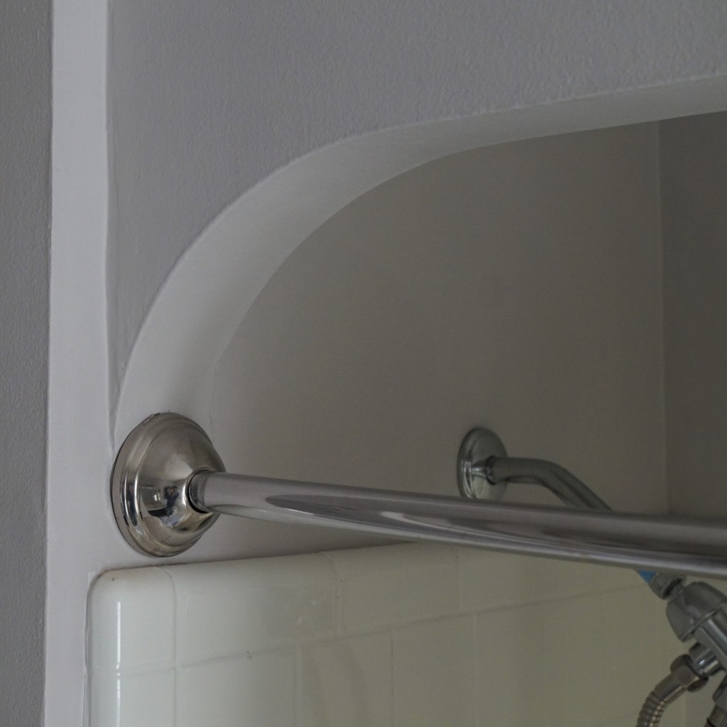
color photo of shower stall upper corner and the adjacent wall painted all together in light gray to contract the bright white tile and chrome-plated plumbing fixtures.
Top-left of the shower features a curve, rather than a squared corner. The curve belongs as much to the wall as to the space.

In this 1940s house there are arches leading into living room, this overhanging shower divider, and the stairs leading up. Curved corners are a recurring architectural feature here. Depending on the lighting and one’s frame of mind the very same spot can stand out for belonging to the wall (extending and completing the edge work) or else belong to the empty space by which one passes between rooms. This mental acrobatics is something like the “glass half-empty versus glass half-full” famous example. There is also the well-known psychological experiment in black and white showing what some viewers recognize as 2 persons’ heads in silhouette, but where others see a vase, instead.

With reference to the photographic theme of this blog, examples can be found in which emphasis or interpretation or sense of main subject can differ greatly in one person’s eyes compared to another’s. A simple example is a landscape scene with a bird or a plane visible in the sky overhead. To a person who loves landscape the details in the sky may be of secondary importance, adding a small counterpoint to the main point of the picture. But to a person keen on birds or aircraft, perhaps the meaning is reversed: it is the flying thing that merits attention. The landscape is merely a place in which the important thing is recorded. But in the photo of the arched corner of this shower, the visual phenomenon at hand is “relatedness”: does the curve belong to the space by which a person gets in and out of the shower? Or does the curve belong to the builder’s idea of graceful architectural structure? The same distinction occurs in the place where perpendicular walls meet the floor or the ceiling. The “corner” is both a space and a physical structure at the same time. Strictly speaking, there is no need to declare that all corners are a physical fabric; or the reverse, that all corners are known by the absence of any other structure. This “both/and” way of appreciating the smooth arch in this photo is the best answer to the question: does an arch consist of space or does it consist of curving material.

In the wider world of lived experience, too, there are surely may instances of “both/and.” A single hair on one’s head is both living (the follicle) and dead (the shaft and lengthening end). An adult can be both a child and a parent. A bout of summer rain can be both life-giving to the dry landscape and life-taking for worms drowned by precipitation beyond a certain amount. The combination of sweet and sour are a proven taste, as is bitter and sweet, or salty and sweet. In these flavor illustrations, each contrasting element contributes to the perception of the other: all sweet soon dulls the mouth, but when accented by salt or by sourness, then the combination triggers compounding of tastes. Just as the shower arch in the photo gains its elegance by wall and by adjacent air, so also in much larger things in life is there a way in which a subject is partly defined by its absence – the edges where it is not.