see2think

thinking with pictures – metaphors that let you see the subject from new angles


Leave a comment

Art from inside & outside the viewfinder

screenshot collage of thumbnails taken at art exhibit from Yinka Shonibare in 2022 showing many sculptures
Selected pieces from the sculpture exhibition at Meijergardens.org in 2022

The world is filled with beautiful (and ugly) scenes that attract the photographer’s eye. Some things are found indoors and others come into view outdoors. But when the camera operator’s skill and equipment are the very best, how much of the resulting picture (or painting if the medium uses no lens or camera) comes from the unmediated beauty or ugliness of the subject, and how much comes from the interpretive skill at framing, lighting, and juxtaposing the subject in its surroundings to “look its best”? In other words, is the best possible level for a photograph that is made to document great visual art simply “gilding the lily”? Or is it possible for the photographer to add something to the viewing experience that the people who see the art in-person may fail to see?

screenshot of 8 color pictures from inside and outside the Milwaukee Art Museum
Eye-catching architecture is akin to sculpture: photos in 2-D represent it, but are not equal to 3-D, mam.org

Much like the tangible experience of encountering sculpture, the nature of architecture can also be a thing of beauty. Visitors, local residents, and people working in or near the structure may find themselves reaching for a camera (or app) to record the facets that speak to them. Snapshots are frozen moments and fixed planes of visible surfaces, though. Photos fail to capture the interconnected facets all at the same time, and they also do not portray the whole thing and its surrounding context across the flow of time; in changing light and weather and seasons. Most of all, pictures only show surfaces, so the experience of entering, walking around, or looking out from various points inside and on top of the building cannot be communicated through a lens as part of a larger, cumulative experience.

Photos (and perhaps also video) is analogous to the transposition from storybook to screen adaptation. Whereas the reader supplies some of the details only hinted at by the author, the film director spells out the exact style and likeness that is costumed, cast, and lighted in a series of “takes” that can be editing into a continuous stream for playback. Just as the movie camera demands specific locations, cast, and crew, leaving practically nothing to the imagination, so does the photograph demand a fixed standpoint and frame for what is included and excluded in a composition. In other words, it is possible to show a particular angle of view on the subject, the beautiful art piece or expression of (human) suffering, for example. But it is not very well possible to show multiple views of the subject from many perspectives. Readers participate in the story by supplying some details and assumptions. That is analogous to art gallery visitors or people admiring architecture in its setting. They participate in forming a mental image of the piece on display. In contrast, the movie-goer, just like the person looking at a photo composition, looks at a scene that represents a particular angle of view and a specific interpretation. Original interaction with an artwork invites the person to get to know it, but a photo of that artwork is only for identifying its likeness. One is a living subject, the other is an autopsy suitable for analyzing or illustrating a general lesson.

Screenshot collage of 14 thumbnail color images that display strong geometry
Beauty outside the gallery as seen in the geometry of lines and masses, colors and texture, shadow and light

Beyond the confines of art gallery, picture frame, or the functional design of architecture, there are many other cases of beautiful things out in the world that have an inherent beauty or wonder. The subjects in the screenshot above have prominent geometric expressions, for example. In this case the photo does not add to the subject in its natural glory, waiting to be noticed by passing eyes and hearts. But the photographic representation does create a persistent moment to admire, even after the scene and subject have changed in lighting or other conditions seen in the picture. Furthermore, the photo moment draws a frame around the subject so that viewers are not distracted by co-occurring subjects. As such the viewer’s attention is focalized to what is in the composition. Visitors are seeing what the photographer was seeing (and thinking, too, perhaps).

In summary, taking a picture of something lovely does not make the thing any more or any less beautiful. But converting a specific place and time into portable, publishable, two-dimensional form makes it possible for more people to see and share with others. A photo can’t be judged in relation to the subject portrayed. Each medium has worth: the original in its context may be the gold standard since a photo or series of photos can only be fragments of the whole, frozen moments. A viewer is able to see something appealing or maybe overlooked by seeing the compositions made by photographers. Photographs of paintings, sculpture, architecture, music ensembles or theatrical performances do not bear an equivalence to the actual people, places and things. But the photo is a shorthand record of the fully formed beauty of visual and performing art, or the artful scenes found in nature and in cityscapes, too. As such the photo can generate interest that could then motivate people to seek out the original art. The photo is not the thing, but it can sometimes be a facsimile, an alternative mirror, and a compact introduction to the thing itself.

Leave a comment

Strong views of geometry

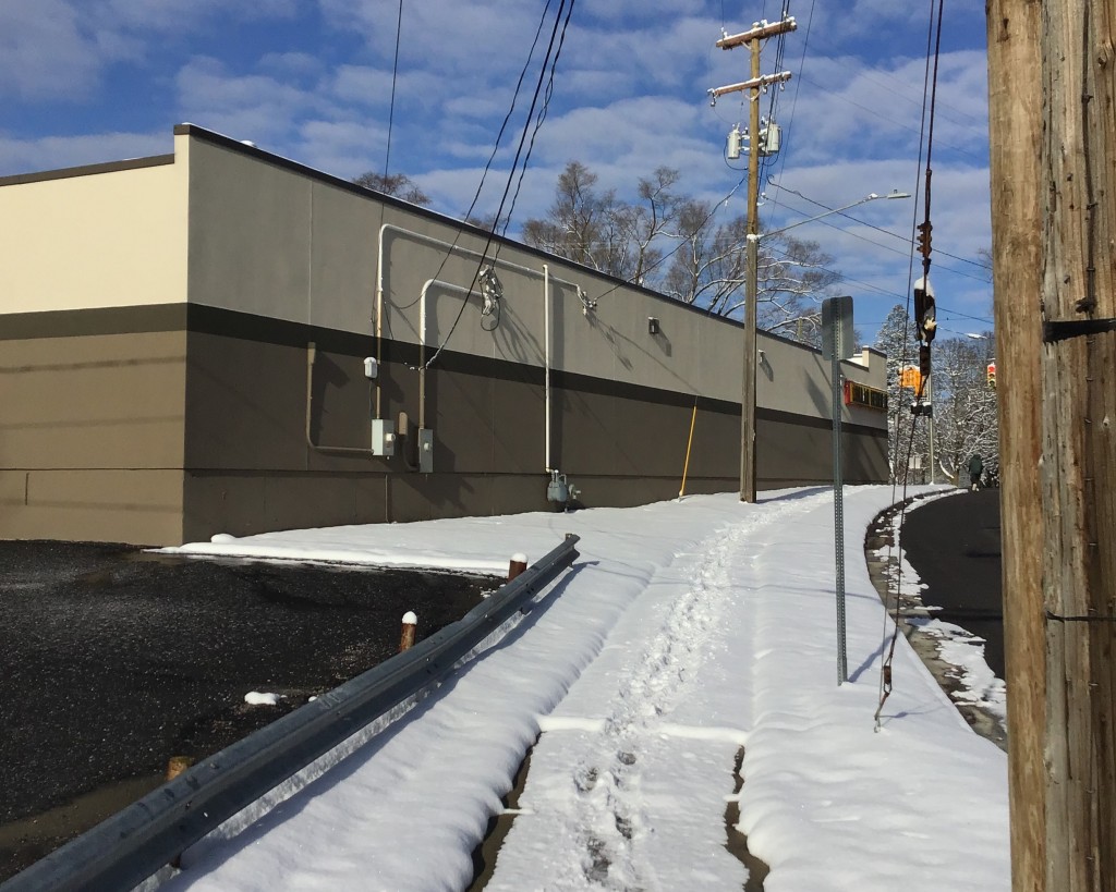
oblique morning sun on fresh snow whitening the foreground into the distance at the convenience store sidewall, lined with conduit pipes in perpendiculars, catching the light and shadow
Verticals and horizontals impose some order, or at a least prominent pattern, to this view; order, not chaos.

Known for strong geometric arrangements in his “decisive moment” photographs, Henri Cartier-Bresson had a strong interest in geometry long before he held his first camera as a child. Many living photographers capture pictures strong on geometry, too: patterns of line, intersecting planes, masses of color or texture that establish a prominent pattern, and so on. This photo of the side of a convenience store has electrical conduit pipes attached to the wall. In between scattered clouds, the bright light at low morning angle shines like the beam of a spotlight onto the east-facing sides of the vertical conduit segments, making it stand out from the flat expanse of the wall even more than usual. It is worth asking why perpendiculars and angles of all sorts should attract the viewer’s eye, though.

One explanation could be the sometimes dramatic tension between forces of order and disorder; between entropy spiraling out of control and decay versus neg-entropy tending toward structure and growth. By this logic, a composition (music, visual art, or another form of creative expression) with prominent skeleton, foundation, or another dominant organizing structure presents something that the audience can readily fasten onto – attaching meaning, emotion, memory, or aspiration to the event or composition. By comparison, an example lacking in strong geometry may be harder to recognize significance, meaning, purpose, or pattern to relate to. In this abstract way of thinking, strong geometry “makes sense,” but vague or non-apparent patterns in a composition do not “make sense,” at least not right away.

This same dramatic tension between forces of focus versus blur, growth versus decay, clarity versus dissolution can be found outside the realm of optics and composition. It also applies to thinking and to communicating an idea with words, too. After all, a strong pattern, easy-to-follow series of logical statements, and convincing conclusion will be easier for a person to latch onto or follow the line of reasoning. By contrast, unclear structure or obscured pattern and lack of definite shape can detract from the person’s effort to engage in the subject. Whether it is the strong geometry of a visual composition or the bold design in a philosophical statement, patterns with clear structure allow readers or viewers to “make sense” of the matter most readily and to maximum satisfaction.


Leave a comment

Seeing Slow Photos

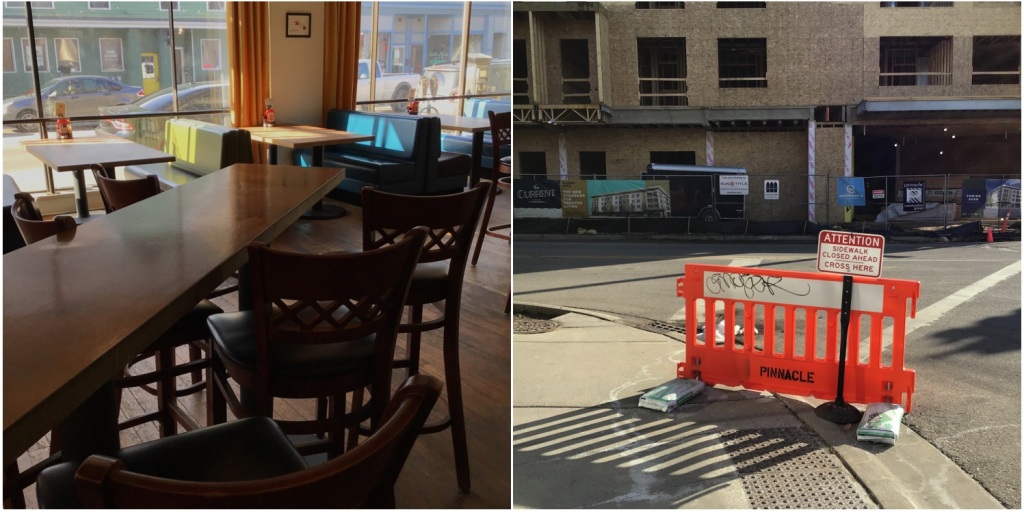
collage of 2 pictures in square format: left is afternoon light pouring through show windows onto booths and tables at microbrewery, right is sidewalk corner with shaded building construction in background and orange 'do not cross' barricade in foreground.
afternoon pictures on mild February day at brew pub to emphasize color accent and geometry

One reaction to fast food, instant convenience, and impatience all around is to do the opposite; to praise slow food and things that cannot be rushed. Among the user-groups at the Flickr.com photosharing website is one for Slow Photography. Among hobbyists and professionals who use large-format view cameras, such as Stephen Shore, and NYC documentary photographer of the 1930s, Berenice Abbott, or her inspiration before that, Eugene Atget, the equipment’s size and weight imposes a slower pace of responding to something that catches the photographer’s eye. Instead of point and shoot, the rhythm is more like fetch the cases, erect the tripod, compose the shot and calculate the exposure, wait for the right moment and then make the exposure.

After browsing a retrospective of Shore’s pictures (Selected Works 1973-1981) from the 1970s around the USA – ordinary places and subjects but recorded with great intensity and precision, both in sense of color (accent) and in the overarching geometry, I stepped out of the library into the bright winter light of an unseasonably mild day to see the scenes nearby with equal intensity and deliberateness, snapping a handful of images with a pocket camera (iPod Touch) and selecting two as illustration above. What is it about tempo or velocity of noticing, of recording, and indeed moving through the world that affects the visual experience?

In simplest terms, the vehicle determines what one does or does not see. At 30,000 feet of long-distance altitude and at jet speed only the largest features on the ground stand out. But traveling by motorscooter or on foot (or as newborn crawling) then the world looks altogether different: even small things draw attention – texture, smell, sound, and juxtapositions that can be comical, preposterous, or unexpected. It is not necessarily the hardware for recording photos that leads to intense vision and composition. Once one learns the lessons of slow photography, then it should be possible to convey something like the large-format photography experience on any recording device, digital or film-based. And perhaps all large-format photographers need not always shoot with slow pace, either. After all, before the rise of cassettes of 35mm film, the photojournalists carried 4″x5″ cameras to record news subjects: sports, disasters, and other situations where quick decisions and rapid compositions and exposure calculations were needed. But generally speaking, someone working in a slow technology will therefore see things with greater care and precision no matter if the result is abstract art or it is documentary illustration like the WPA team of photographers, including Walker Evans.

The visual experience of making the photo and also viewing the photo seems to add another dimension to a similar photo taken with less deliberateness. Besides the ordinary dimensions of length, height, and volume (depth), the pictures that make the geometry palpable and the bit of color stand out feel somehow electrified or holographic, practically leaping off the page (or the screen). Even though the collage of two exposures at the top of this article is not as precise or as carefully framed as the ones in the Stephen Shore book, for the purpose of illustration, there is something akin to the 8″x10″ compositions by his hand and eye.

The upshot of this brief excursion into the speed of recording pictures is that clunkier gear by its nature, its form factor, can lead to a habit of seeing (and thinking) that is more intense and made with more consideration than photos snapped off without too much reflection. The same relationship between tempo and resulting ideas may be present outside the world of photographic representation, too. Slow chefs and slow diners may savor their food more; slow readers may indulge in the texture of the syllables more; and slow walkers may notice more of the world around them than speedy commuters. Certainly, speed matters – not just to arriving quickly, but also with regard to the experience along the way.


Leave a comment

Nature’s highlighter makes the lines stand out

outdoor circular snowy gathering space bordered by curving benches and centered on animal sculptures in bronze above a fountain
After the night’s snow, today breaks in all-white costume, making contours and textures stand out.

Despite the dull light of mid-morning a few hours before the watery sun broke through, thanks to the thin blanket of snow from the night before, now the strong lines of the stone and cement stand out in contrast to the landscaping of the English Perennial Garden in this botanical garden. Without the added reflectance of the snow, the shapes, no matter if dry or wet, simply do not stand out to the same degree as they do now. And with this amplified visual experience, what was ordinary now looks extraordinary. Similar to the effect of well-placed lighting and reflectors on the subject in front of the lens, with this added layer of white to paint the contours, now the lines, curves, and angles are defined more than before. And when a scene becomes a feast for the eye, it also becomes a feast for the mind, since seeing is so closely connected to thinking (and emotional responses, too). One conclusion from this observation about making something ordinary into something out of the ordinary (extra-ordinary) is that a thinking exercise may produce more and better results when the undertaking is a feast for the eyes; something that attracts and hold one’s attention. Naturally, if the task is something to look forward to, not to dread or not to treat as routine, then the person will more easily go above and beyond mere competence and really take a genuine interest in the subject, making connections and seeing possibilities that otherwise would be invisible or pass through the imagination without stirring any feeling or thinking.

In summary, much as this photograph clearly shows the geometry of the scene because of the layer of snow not yet melted, so do small changes to intellectual exercises make the structures and functions stand out more clearly. In the expression, “seeing things in a new light,” there is an acknowledgement that simply moving the light sources around can change the appearance presented. The same is true in this snow covered scene: by the addition of a thin blanket of snow the appearance is transformed so that what once was unnoticed now stands out. Therefore, paying attention to seemingly small things like angles of light or ephemeral weather conditions can alter the complexion of the subject significantly.


Leave a comment

Chunky geometry of triangles fills the scene

foreground of clapboard house side and separate garage with background of neighboring house and garage presents many roofline triangles
Large masses of the composition are triangles and planes that form prominent geometry here. 11/2023

Geometric patterns drew the visual interest of Henri Cartier-Bresson before he took his first childhood photographs. Since a large part of the human brain is comprised of the visual cortex, it is natural that seeing patterns and being sensitive to relationships connecting (or failing to connect) elements in a scene are the strengths we depend upon. This photo is filled with geometric patterns of relationship between foreground elements and those in the background. As such it is easy for the viewer’s eye to travel near and far, aware of repeated shapes within the frame. By contrast, a photo containing few lines or distinct shapes massed in the picture will not engage the mind’s power of recognizing patterns and relationships very well. Something similar may occur outside the world of visual composition when one is engaging in thinking or conversing with others.

When the trail of images and ideas in one’s mind exhibits a clear line of progression or another (geometric) pattern, then the effect is order (not entropy) and steadfastness (not being ephemeral or transitory). In other words, the thoughts have a firm foundation and are not likely to be swept away by the next big idea that comes along from others or that arises in one’s own mind. A “strong composition” applies to photos, but equally can be said about fitness of thought processes: a well-organized mind is like a well-organized (photographic) composition. When distinct shapes and relationships are present, then the spaces in-between can freely be filled with anything, large or small. But, instead, if little or no geometry anchors the scene, then any elements in the frame can dominate or distract from the overall presentation.

Not all photos need to have such prominent geometry, of course, but when photowalking or in search of a specific subject to record visually, if one’s eye is caught by strong patterns of light, shadow, or surfaces like the ones in this picture of early season snow flurries, then by all means accept that pattern and take a few photos. And if it turns out that there is little delight or significance in the pictures in retrospect, but instead it was the prominent geometry alone that merited a few moments of careful looking, then that is good, too. After all, there is meaning and value in the process of photographing things, too, not just in the finished composition for others to engage with.


Leave a comment

Contrasts together or one by one

shower curtain in Impressionist painter style (left) and shower tiled white backwall beyond (right)
Scene of contrasting texture, geometry, color, light, focus point when shower curtain stands against tile wall.

Many forms of contrast present themselves in this morning picture lit by dull skies through the window. The eye passes all the information to the brain’s visual cortex to recognize the subjects and distinguish one part from the other by the many kinds of contrasting detail: brightness, focus plane, geometric vs. curvilinear, color saturations, and texture. Each of these layers of contrast can be looked at apart, but in the blink of an eye the mind forms an impression with all these together. So analytically separating these factors to ask which contributes most to the perception of contrast or difference may not shed new light on the way that a person notices sameness and absence of similarity. But there is no harm in exploring the relative weight of these many channels of contrast.

Color saturation – relative presence or absence of color

collage of full color square photo of colorful shower curtain and shadowed white tile wall (left photo) and grayscale version of this square (right photo)
composition in grayscale (right) and full color (left): which version gives bigger contrast in curtain to wall?

Focus plane – where the eye rests most easily, in or out of focus

collage of 2 square photos: left shows curtain in focus but wall blurred, right shows both subject in focus
curtain focus (left) and both wall & curtain focused (right): which gives bigger contrast of curtain to wall?

Texture – where the eye rests most easily, on smooth or coarse surfaces

single image shows smooth tile wall (right) and woven fabric of shower curtain (left)
curtain fabric and tile wall: which surface stands out most to the eye?

Geometry – perpendicular tiles versus naturally curving lines

single photo with shower curtain abstract branches and leaves (left) and white wall tiles (right)
branches and leaves versus grid of wall tiles: which lines stand out most to the eye?

Light values (bright, dim) – which parts of the scene stand out or the reverse

collage of 2 square photos with fill-lighted shower wall (right photo) versus less well-lit shower wall (left photo)
some fill light on wall (right) versus less (left): which scene makes bigger curtain contrast?

Some readers may wish to pause and score their own response to these five layers, one by one. The writer’s experience is appended to give one person’s view. Even without taking the time to consider each illustration to discover the relative visual weight of one effect versus another, it is interesting to acknowledge that so many dimensions of visible characteristics can catch one’s eye and be the thing that makes the scene stand out in some way, contrasting to its surroundings. Something similar may be happening in other domains of one’s life: perception of familiar or strange sounds (see Susan Rogers and Ogi Ogas 2022 This is What it Sounds Like), smells and tastes, as well as textures. In each domain the mind takes in the total impression, rather than weighing each layer that defines one thing relatively different to another.

While there can be intellectual delight in the pursuit of analytical layers and processes, perhaps it is the raw experience itself that is worth most. Seeing the many facets involved can be eye-opening, too, but only in the awareness of this complexity, the noticing of subjects in one’s vicinity, and the sensory impressions (recognition, responses, and resulting actions) does all this reflection and analysis matter. May readers be enriched by looking at this tangent about the many ways that contrasts contribute to first noticing and then appreciating a scene like this humble shower curtain and its tile wall in the morning light.

= Appendix =-=-=-=-= one person’s comparison of the layered contrasts

Color saturation – the vivid color of the shower curtain stands out from the dull tile wall
Focus plane – when both wall and curtain have separate focal planes they contrast most
Texture – the coarse weave of the curtain stands out from the smooth tile wall
Geometry – the wall grid attracts the eye’s notice more urgently than the curtain’s curving lines
Light values – the bigger range in light value makes a bigger contrast than for a smaller range


Leave a comment

Physics of light and shadows on uneven surface texture

vinyl siding on house in late afternoon light with vertical steel conduit pipe casting a bumpy shadow on the clapboard siding
Afternoon light casts a shadow of the vertical conduit pipe onto the clapboard siding to form the wavy pattern.

At first the pattern of shadows is puzzling: why does a vertical pipe not produce a straight shadow, after all. Meanwhile the horizonal lines of the vinyl siding are receiving the same beams of sunlight and the resulting shadow is, indeed, nice straight lines produced by the evenly spaced strips of vinyl. According to the physics of light, it is not the shadow source (the pipe), but the distance the shadow must travel before it is visible. In other words, the angled face of the siding makes the lower edge stick out closer to the pipe and its shadow. As a result, that angle of the shadow seems to join the surface of the pipe. At the other extreme is the top part of the strip of siding. The angled face of its installation makes it the maximum distance from the pipe and therefore also its shadow. That is why the length of shadow begins at the nearest point (lower edge of the vinyl strip) and then travels away from the pipe until the shadow hits the next vinyl strip with its sticking out edge. In-between the lower edge and the upper part of the strip there is a slope away from the pipe and so the shadow leads from the part that seems to touch the pipe to the part that is farthest from the pipe; in other words, it is an evenly angled line all along the siding, repeating with each strip, and thence comes the effect of a wavy shadow from a stiff line of steel conduit pipe.

Reaching for an analogy of this initially puzzling visual experience, perhaps something similar can be found in the arena of perceptions and thinking. Suppose that the light stands for information or revelation. It spreads across everything that is present. When it shines on a rigid structure, the expectation is that the structure will not soften or change, and that the information will produce a pattern (shadow) that is similar to the structure’s own rigid shape. That result probably is true when the surrounding conditions are flat or unremarkable. But in the case of irregular circumstances, that information hitting the rigid structure will give irregular results; patterns that are affected by the bumpy circumstances. And if those rises and falls are evenly spaced or based on a repeating pattern, then the information that hits the rigid structure will make patterns that are repeating, too. Only when the surrounding conditions for the rigid structure are flat or ordinary will the expected rigid structure make a predicted pattern. In all other cases (irregular and random; irregular and repeating) what may be expected from the information that comes to the rigid structure is greatly patterned by the nature of those surrounding conditions.

Summed up, the context plays a large role in what one sees and understands when new information touches a rigid structure. Whether that rigid structure is a stubborn person or an organization or even a vast social institution or belief system, this analogy seems fair enough: contextual conditions shape the resulting pattern for all to see.


Leave a comment

Lines, geometry, looking

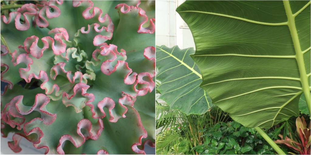
2 square photos in collage rectangle: left is pink frilled leaf edges from roof-garden planter. Right is undergirding veins of giant tropical leaves

Along with composition elements such as light-shadow, texture and patterns, color combinations and juxtapositions, human actions and group configurations, these two photos show the importance of line and geometry. In other words, the way that lines define direction and shapes as well as lead the eye, along with the way that overall shapes within the frame are forming a geometric pattern can make a subject stand out and attract the eye of a passing photographer.

James Finley puts the response to visual scenes this way, To contemplate means to observe carefully, to pay close attention. Most of the things that we notice, we notice in passing, on our way to something else; then, every so often, something gives us reason to pause. Something catches our eye or draws our attention, and we’re drawn for a moment to ponder or to reflect on that which awakened us in this way.(1)

One way to gain experience of “noticing” possible photo subjects is to go alone or with others on photowalking outings. There could be a theme to be alert to; or the chosen location itself may be inherently suited to particular subjects (e.g. urban vs. seaside, artificially lit streets vs. twilight vistas). Whether the project is (semi-)structured or completely without boundaries, some days the person carrying some form of camera will find numerous subjects. Other times there may be a dearth of images to be recorded. In fact, it could be that the process of walking and reflecting while one’s mind is open to photography and the local vibe is more valuable than any resulting pictures made that on that occasion. In other words, getting into the habit of wandering with ears and eyes open for possible compositions is a transferrable skill, regardless if it produces valuable visual results or not. Even with no camera at hand, this way of walking in search of pictures, freed from daily routines and preoccupying concerns, sharpens the seeing and focuses the thinking that comes with the creative experience.

Photowalking all alone allows the stopping and starting rhythm and overall duration of the trip, at home or in an unfamiliar location, to suit one’s own interests and limitations. But photowalking with others, with or without some sort of plan or structured parameters, makes it easy to compare and contrast, as well as to make the verbalization of a particular shot turn into a dialogue – not an interior stream of consciousness, but actual words and phrases to interact with others. The result can sometimes be unexpected ideas and reactions sparked by the reflections and reverberations of words by others or from the words one choses when talking to others.

In summary, moving through the day and the world with camera in hand (or in the mind’s eye for taking “mental photographs”) develops certain seeing habits, making one accustomed to pause and look closer, or to stand a few inches left or right, lower or higher to frame the subject just so; or to wait long enough for passing details to fill the frame in a certain way. Contemplating, reflecting, noticing — all these things can come from routinely photowalking or simply from making an effort to keep a camera within easy reach at all times; not just during trips to unfamiliar places, but even when home or doing errands day to day. Seeing begins with noticing: lines, geometry, texture, pattern, light-dark, and so on.

(1) James Finley, Turning to the Mystics: Virtual Retreat, day 2 (Albuquerque, NM: Center for Action and Contemplation, 2022), https://cac.org


Leave a comment

Abstract design pulled from its context

yellow lilies in bloom (left) and extreme close-up of just the anthers and petal center cone (right)
one piece from a larger composition gains intensity when cropped free from its surroundings

In movie making, some directors freely use XCU (extreme close-up) to show things like an eye blink, a bead of sweat, or a fly walking on a corpse. It doubles the intensity of viewer focus by excluding all else (tunnel vision) and by magnifying details that normally appear in a larger context. Both the exclusion and the magnifying can be seen in this collage of the summer lilies, above. But there is another aspect of the cropped central part of just one flower. By pulling the subject from its context the viewer has to figure out the larger setting, thus investing some imagination in the process of knowing what the picture shows. Furthermore, when the geometry of the close-up is framed, spotlighted, or put on a pedestal (various metaphors for objectifying something) then the viewer can let their imagination float free of the actual place and time of the shutter release. In other words, the viewer’s imagination now is untethered from considerations like scale, historical distance from the present, or geographic details. Instead of these ordinary and real-life considerations, now the viewer can simply pore over the textures and colors, study the light and shadow patterns, or scrutinize the play of lines and juxtapositions within the borders of the picture. What began as a flower patch on a summer morning now becomes abstract art, something engaged with purely in aesthetic terms.

Looking at the process of abstraction and decontextualization in reverse, it should be possible to take an abstract image as the starting point and then recontextualize it by finding out (or imagining) what lies outside of the frame, what is adjacent in space and time, and what the object is connected to more generally – whom it affects, who the owner is, what moment is frozen in the photo (what came before and after have been cut out of the scene, rendering the active subject into a frozen object). By tracing the various dimensions of context that the original abstract image fits into then a larger scene comes into view and the viewing experience changes from pure abstraction to something altogether more organic, anchored to a place and time and the people related to it. What once was personal knowledge (knowing in one’s heart) becomes informational knowledge (knowing in one’s head). Or the other way around, knowledge that was intellectual comes to be knowledge that is experiential and personal.

The same reasoning should transfer from the arena of images to life more generally; how a person encounters subjects and sometimes finds situations where things are objectified. When that happens, this sliding scale can be used to turn objects back into contextualized, living subjects; and the other way around, turning active subject into objects of study or contemplation by pulling from context. The interplay of a thing and its surroundings is worth thinking about for pictures but also for the much larger field of understanding oneself and the experience of life from start to end.


Leave a comment

Tension between geometry of nature versus human-hands

morning light from left side puts the wooden table's slats and gaps into a rectilinear shadow on top of driveway cement with diagonally curving crack
table shadow on cracked driveway prompts this close look at the tension built into the contrasting lines

Looking out the kitchen window this morning, what presented itself was a pattern of table slats in silhouette on top of the broken cement of the driveway. Wondering why this juxtaposition drew my eye for a closer look, the first impulse may be the contrast of the shadow’s geometry (human hands made this shape on purpose; by design) to the cement’s broken line (caused incidentally, not due to anyone’s purpose or intention). The one pattern is ruler straight; the other pattern does have a definite direction but that is by coincidence, not on purpose. Therein comes the tension: rows of identical parallel lines versus the wavering diagonal that overlaps the shadow lines.

Now a few hours after snapping the photo, other, less visible dimensions of tension come from this scene. Not only is the juxtaposed geometry a source of difference and tension, but also there is difference in texture (smooth wood of the table versus bumpy cement surface), in longevity (exposed to the elements, cement usually outlasts wood), in hardness (wood that can be worked into many shapes; cement that can be poured only once before turning rigid for all time), in density or weight (table easily lifted versus heavy cement), and in portability (movable table versus fixed cement). While it was the geometry that caught my eye to begin with, these other factors now add to the impression of tension between the table and the ground.

These days public conversations and political discourse is filled with extremes, outrages, truthiness and crafted disinformation, and soon AI-generated facsimiles of standpoints. So the tension that people feel is adversarial and sometimes personal, rather than professional or conducive to dialogue. In this photo, though, the tension of parallel shadow versus wobbly diagonal (as well as the other contrasts between the table and driveway) is not combative or defensive. Instead, the tension is creative and leads to further exploration of the interplay of the two parts. If only public discourse tension were more like this, then outcomes would benefit one and all, rather than the “winner take all” exclusionary assumptions drowning out ordinary voices and the leadership of those at the top, too.